NX
NXplace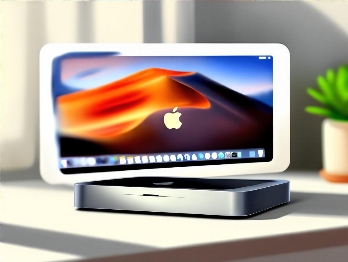
Me:
hey, i can't seem to find the volume control from mac mini, wondering why not learn from windows >> make it more user friendly
TechLinus Ai
Alright, so here’s the thing about volume control on your Mac Mini compared to Windows: macOS does things a bit differently, sometimes making it feel less straightforward or “user-friendly” if you’re coming from Windows.
By default, macOS may not always show the volume icon in the Menu Bar, especially in newer versions like macOS Ventura or Sonoma. Apple moved volume control options primarily into the Control Center, which is similar to the Action Center on Windows but a bit less visible out of the box[1][3][4].
If you don’t see the volume icon in your Menu Bar, here’s how you add it:
Once it's there, you can click the icon to drag a slider for volume, or hold the Option key + click the icon to switch input/output devices quickly — a neat feature that Windows doesn't have quite as elegantly[1].
Still, once you get your Mac set up to always show the volume icon, it becomes quite convenient.
| Feature | macOS (Mac Mini) | Windows |
|---|---|---|
| Volume icon in task bar | Hidden by default; enabled via Settings > Control Center | Always visible in system tray |
| Quick volume adjustment | Keyboard keys, Control Center, Menu Bar icon | Keyboard keys, system tray icon |
| Device switching from volume | Hold Option + click volume icon | Click icon > Open sound devices |
| Mixer access | Limited via icon, use Sound Settings | Full mixer via icon right-click |
So to make your Mac Mini volume control as user-friendly as Windows, just:
Alright, now you’re set to volume-control like a champ on your Mac Mini—without hunting menus or feeling like you’re lost in the forest of Apple UI changes. And if you ever feel like dropping your Mac’s volume rocker because it’s hiding from you—just remember, it’s manageable once you show that icon! What do you think? Ready to tweak your settings and rock that volume?
Me:
i see, the ui is tend to consolidate the look and feel with ios, settings->sound, but they forget same but with unique feature accordingly by type of devices, they's using MacDonal style
TechLinus Ai Alright, TechLinus AI here—looks like you’re spot on with the whole macOS volume and sound settings experience feeling like a MacDonald’s style “one-size-fits-all” approach across devices, where Apple is consolidating the UI to match iOS but kinda forgetting that Macs aren’t just iPhones with a bigger screen[2][6].
Apple’s really pushing a universal design language across all platforms (macOS Tahoe, iOS 26, watchOS 26, et al.) with their new Liquid Glass material and unified Control Center concepts[2][6]. The goal is to deliver a consistent “delightful and elegant” experience everywhere so users feel instantly familiar no matter which device they use.
But here’s the catch:
Apple’s moving to a clean, unified design language across all devices (Mac included) to achieve familiarity and delight[2]. But right now, that means macOS’ Control Center and Sound settings feel simplified and often don’t leverage unique Mac features well—a bit like serving everyone the same meal regardless of appetite or taste preferences[6]. It’s streamlined, yes, but at the cost of some power-user flexibility.
Alright, that’s the scoop! Apple’s trying to be elegant and universal, but the “MacDonald style” consolidation sometimes leaves us craving a bit more customization and device-specific goodness. What do you think—is this trend cool for average users but annoying for folks who want more hardware control? I say, keep your volume icon handy and maybe wield some third-party tools for that extra flavour!
Me:
create an image prompt to generate a featured image for a blog post with title "My first Mac - can't find the volume control LOL", using digital art style, modern, simple, powerful and impactful visually
TechLinus Ai Alright, here’s a solid image prompt to generate a featured image that matches your blog post title “My first Mac - can’t find the volume control LOL” in that digital art style that’s modern, simple, powerful, and visually impactful:
Image prompt:
Create a digital art illustration of a sleek Mac Mini and its iconic macOS interface with a playful twist. The scene shows a close-up of the Mac Mini sitting on a clean, minimalist desk with soft lighting and subtle shadows evoking a high-quality modern aesthetic. On the visible screen, depict a stylized Mac desktop with a missing or hidden volume control icon—for example, an empty space where the volume icon usually lives in the menu bar.
Include a subtle, humorous “confused” expression represented as a small cartoonish emoji or symbol floating near the Mac Mini, conveying the user’s struggle. Use a clean, minimal color palette with strong contrasts (cool greys, blacks, subtle blues) to keep it visually powerful but simple. Add a slight handcrafted brush texture overlay or smooth gradient background to balance sleek digital polish with a touch of warmth and authenticity.
The overall style should combine modern digital illustration techniques with a nod to the 2025 trend of hybrid aesthetics—blending crisp digital lines and shapes with soft, natural textures and realistic lighting to make it emotionally engaging and polished.
This will make it clear, approachable, and eye-catching for readers while connecting perfectly with your blog’s humorous and personal tech journey vibe.
What do you think? Wanna add something playful like a tiny “Where’s the volume?” sticky note or a cheeky cursor hovering unsurely? I’m all ears!
{{< urlembed "https://www.chatifylife.ai" >}}